We’re excited to announce that our Styling APIs have entered Client Beta and are now ready for use in your live experiences. Thank you for your valuable feedback during the Studio Beta. You can now publish experiences using our StyleRule, StyleSheet, StyleLink, and StyleDerive instances.
Hi Creators!
Today, we’re excited to introduce UI Styling as a Studio beta! UI styling is a Roblox-native feature that lets you declare and globally apply overrides to UI instance properties. This has been a long awaited feature with lots of anticipation from the community – we can’t wait to hear what you think and see what you build
We’re launching:
Multiple APIs to define and apply UI styles, including:
StyleRules define styled properties which override properties on the instances affected by the Selector property.
StyleSheets aggregate StyleRules and can be linked to DataModel trees to apply style properties to instances.
StyleLinks connect a StyleSheet to the instance tree whose root is the parent of the StyleLink.
StyleDerives reference another StyleSheet for a parent StyleSheet to inherit StyleRules and token definitions
A no-code Style Editor built into Studio that allows you to globally manage UI styles & themes. These can be used to:

During this Studio beta period, you can opt into usage of the APIs and Studio tooling via the Beta features tab in Studio. At this time, you can’t publish any Styling instances (or references to Styling instances) into your live experiences. We are hoping to use this beta to get your feedback and stomp out any issues – please let us know if you have any in the comments below. You’ll be able to start publishing experiences with Styling when we move into the client beta phase within the next couple of months.
Keep reading for more details on how to start using the Styling Editor and API!
To enable this beta in Roblox Studio, follow these simple steps:
Open Roblox Studio and navigate to the “File” menu.
Click on “Beta Features”.
Enable the “UI Styling” option by checking the corresponding checkbox (see screenshot below) and press Save.

image51382×136 10 KB
Restart Roblox Studio when prompted.
Improving Your UI Workflow With StylingIn the past, visually styling UI elements typically involved manually adjusting the properties of each individual UI instance. In an experience with numerous UI elements, this process could quickly become cumbersome – having to search through the Datamodel tree to locate the right instance, match its properties exactly to another, and repeat the process for each one.
Styling separates defining the structure of UI elements from their visual appearance. This is extremely powerful – teams can now iterate quickly across color palettes, fonts, and other themes without recreating instances. We’ve taken some inspiration from CSS, a common programming paradigm used to style web pages. This page provides an in-depth overview of Styling. If you’re familiar with CSS (or want to learn more), check out this guide comparing Roblox’s Styling with CSS.
What exactly can you style? We’ve added Styling support for UI-related classes! Note that not all properties within each class will be styleable – this page will have the most updated list of styleable properties. Additional support may be added over time!
How to Use the Style EditorThe built-in Style Editor is a comprehensive tool that allows you to create, manage, and apply UI styles for Roblox experiences through a combination of design sheets, style rules, tokens, and themes. You can find the Style Editor under the UI tab.
There are 3 types of StyleSheets you can create in the Style Editor:
Design: UI Element style rules and tags
Class rules: A class selector targets all instances of a given UI class. Here’s an example that styles all Frames with a uniform background color and size.
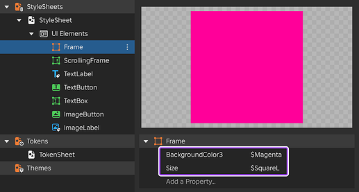
image81280×688 33.5 KB
Tag rules: Tag selectors target specific UI objects tagged through CollectionService. Here’s an example that shows a TextButton tagged as ButtonPrimary with a custom background color, font, and text size.
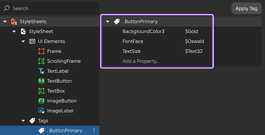
image31280×656 30.8 KB
Modifier rules: Instance pseudo-instance selectors apply phantom UIComponents such as UICorner or UIStroke to an object. This achieves the same result as inserting a UIComponent under an object in the DataModel–without actually inserting anything! Here’s an example that styles a TextLabel and a TextButton with the same rounded corner

image21280×496 27.1 KB
State rules: GuiObject state selectors correspond to one of the four GuiState enum values such as Hover, letting you automatically configure style changes for interactive states. Here’s an example that creates a hover state of -4 degrees rotation for all ImageButtons.

image41280×528 21.4 KB
Tokens: Global UI property variables that can be used across styles and components. For example, Frame.BackgroundColor3, TextLabel.TextColor3, and UIStroke.Color could all be set to a common color variable named Magenta. Here’s an example of what a Token StyleSheet could look like.

image7800×560 11.7 KB
Themes: A swappable defined set of property values. Here’s an example of what a Theme StyleSheet looks like – on the “General” folder, you can toggle between ThemeA and ThemeB to swap what values BackColor, ButtonFont, and ButtonTextSize are set to.

image11000×684 44.1 KB
StyleSheets are stored in ReplicatedStorage. When you use the Style Editor, you may notice a BaseStyleSheet there – this is automatically generated by the Style Editor when you create your first Design StyleSheet.
The building blocks of Styling above can be combined to achieve some powerful new workflows. Check out our video tutorial or see this document for a step-by-step walkthrough of how to use our Style Editor, best practices, and some ideas of what it can achieve! If you want to follow along at home, you can find a sample placefile here: Styling Advanced Example.rbxl (76.2 KB)
How to Use Styling APIs in ScriptWhile you can author UI Styles completely using the no-code Style Editor, you can also use scripting to create styles with additional run-time functionality!
Define StyleSheets and apply them to UI instance hierarchies
Click here to see a working script example -- Parent this script to a ScreenGui under StarterGui. local CollectionService = game:GetService("CollectionService") local ReplicatedStorage = game:GetService("ReplicatedStorage") local screenGui = script.Parent -- DesignSheet local sheet = Instance.new("StyleSheet") sheet.Parent = ReplicatedStorage -- Configure rule local rule = Instance.new("StyleRule") rule.Selector = "TextButton" -- Class selector rule.Parent = sheet -- Set rule properties rule:SetProperties({ ["BackgroundColor3"] = Color3.fromHex("335fff"), ["TextColor3"] = Color3.fromHex("e1e1e1"), ["Size"] = UDim2.new(0.15, 0, 0, 40), ["BorderSizePixel"] = 0 }) -- Create a UI local button = Instance.new("TextButton") button.Text = "Main Menu" button.Parent = screenGui -- Apply styling to UI local link = Instance.new("StyleLink") link.Parent = screenGui link.StyleSheet = sheetCreate tokens, themes, and dynamically swap themes at run-time based on game state or player data
Click here to see a working script example -- Parent this script to a ScreenGui under StarterGui. local CollectionService = game:GetService("CollectionService") local ReplicatedStorage = game:GetService("ReplicatedStorage") local screenGui = script.Parent -- Tokens local tokens = Instance.new("StyleSheet") tokens.Name = "Tokens" tokens.Parent = ReplicatedStorage tokens:SetAttribute("SquareS", UDim2.fromOffset(50, 50)) tokens:SetAttribute("SquareM", UDim2.fromOffset(100, 100)) tokens:SetAttribute("SquareL", UDim2.fromOffset(200, 200)) tokens:SetAttribute("Fit", UDim2.fromScale(1, 1)) tokens:SetAttribute("Magenta", Color3.fromHex("FF0099")) tokens:SetAttribute("Gold", Color3.fromHex("FFCC00")) tokens:SetAttribute("Aqua", Color3.fromHex("0093F0")) -- ThemeA local themeA = Instance.new("StyleSheet") themeA.Name = "ThemeA" themeA.Parent = ReplicatedStorage local tokensDerive = Instance.new("StyleDerive") tokensDerive.StyleSheet = tokens -- Derive global tokens tokensDerive.Parent = themeA themeA:SetAttribute("TextButtonSize", "$SquareM") themeA:SetAttribute("TextButtonColor", "$Aqua") -- ThemeB local themeB = Instance.new("StyleSheet") themeB.Name = "ThemeB" themeB.Parent = ReplicatedStorage local tokensDerive = Instance.new("StyleDerive") tokensDerive.StyleSheet = tokens -- Derive global tokens tokensDerive.Parent = themeB themeB:SetAttribute("TextButtonSize", "$SquareL") themeB:SetAttribute("TextButtonColor", "$Magenta") -- DesignSheet local designSheet = Instance.new("StyleSheet") designSheet.Name = "DesignSheet" designSheet.Parent = ReplicatedStorage local themeDerive = Instance.new("StyleDerive") themeDerive.StyleSheet = themeB -- Derive from ThemeB themeDerive.Parent = designSheet -- Link DesignSheet to ScreenGui local styleLink = Instance.new("StyleLink") styleLink.StyleSheet = designSheet styleLink.Parent = screenGui -- Configure rule local rule = Instance.new("StyleRule") rule.Selector = "TextButton" -- Class selector rule.Parent = designSheet -- Set rule properties rule:SetProperties({ ["BackgroundColor3"] = "$TextButtonColor", ["Size"] = "$TextButtonSize", ["BorderSizePixel"] = 0 }) -- Create and style UI local textButton = Instance.new("TextButton") textButton.Text = "Press me to change my theme!" textButton.TextWrapped = true textButton.Parent = screenGui textButton.Activated:Connect(function(inputObject: InputObject, clickCount: number) if themeDerive.StyleSheet == themeA then themeDerive.StyleSheet = themeB else themeDerive.StyleSheet = themeA end end) Tips Click here to read moreStyleRule property overrides only apply if the instance property is set to its default value. To reset the property to its default value, right click the property in the properties panel and select Reset Property to Default.
You can only apply one pseudoinstance of each type per instance. This means for a Frame, you can have a ::UICorner, ::UIStroke, ::UIGradient, etc. pseudoinstances, but if you have two UICorners, only one phantom instance is created.
You can only apply one StyleLink per instance in the Datamodel. If there are two StyleLinks parented to the same instance, only one will take effect.
A BaseStyleSheet will only be auto-generated and derived from if you are using the Style Editor.
Deriving or linking to a StyleSheet that is not in the DataModel will have undefined behavior. Using a StyleSheet outside the DataModel is not supported.
UI Styling was made possible thanks to @Tiffblocks, @nomnomhungy, @ThunderBolt5140, @TangyTrout, @stadium_parkour, @uiuxartist, @DrRanchDressing, @hughtesting, @hijabiIntern, @rbx_dert, @KarRic22, @slamborgen, @butterthebig, @IgnisRBX, and @darthskrill. We also want to give a huge thank you to our early testers who gave us feedback along the way!
We can’t wait to hear your thoughts on UI Styling and see all the amazing things you create! Let us know about your experience and if you encounter any issues!
